Virtual gallery reflection

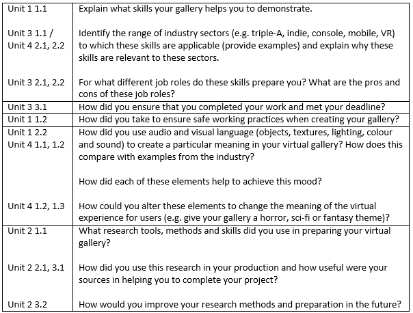
Here is my reflection on my virtual gallery I built recently, I answered the questions that we were given for each Unit. Here are the questions for the virtual gallery reflection:

reflection table

Unit 1 1.1: 

The virtual gallery helps me display my skills, the skills it includes are 3D modelling skills, Photoshop skills, audacity and audio producing skills, my Adobe priemier skills and syncing skills, my programming skills. It also displays my lighting skills and manipulating how it works, my animation skills, creating textures and applying them, my scripting skills and my Unreal engine skills.

Unit 3 1.1/ Unit 4 2.1, 2.2: 

There are many industry sectors that the skills used in making virtual gallery can be applied to such as mobile gaming like the IPhone, console gaming like Xbox one, advertising and games for VR like the Oculus Rift, Google Box VR. This is because all the skills and technologies converge with the companies as all of them use 3D modelling, animation, Photoshop, audacity and recording audio, Adobe preimier, lighting and texturing, the only one that might not use unreal is advertising.

Unit 3 2.1, 2.2: 

These skills prepare us for job roles like a 3D modeller, a job that involves texturing, a sound engineer and a video editor. Here are the pros and cons of the job roles:

Pros: 

They all have creative freedom in there work, allowing a creative person to explore more and create things under their own influences. This makes them feel more free in what they do, making them feel happier.

When they finish a piece of work, it can make them feel very accomplished and proud in what they have made, whether it took them a day, week or month, this makes work very rewarding.

Cons: 

They all involve long periods of sitting down which can cause health problems in the future if the employee didn’t get any excise or if the employee doesn’t take quick breaks from the computer.

Some of the pieces of work they create might be rejected by the employer or the main leader in the production of the product. This can leave the employee feel very disappointed about creating something they put a lot of work into not being used.

Unit 3 3.1: 

I kept myself organised which saves time, I did this by priortizing the improtant work that needed to be done and then doing work that I can do at home or work that was not a major priority for the gallery. To give you an example of this, I made all the 3D models and textures for them and place them in the gallery first as it was the most important piece, then I started making a 3D model for the voiceover, which was less important.

I also organised my work by making folders appropriately named for each type of work I did for the project, such as I made a folder called textures to hold all the textures for the virtual gallery and made a separate folder called 3D models and placed all the 3D models in that folder. This way I could easily find the files I need without wasting time, this allowed me to meet my deadline.

Unit 1 1.2: 

I took regular breaks to ensure that I am not straining my eyes, they were about 10 minutes long, long enough to allow my eyes to rest and short enough to allow more time on my work. I also kept a good posture by having the chair kept straight and also had the computer at eye level and I kept drink and food away from the computers as it is a hazard. I was also careful of cables in case I tripped, I did not overload plugs and I kept myself hydrated.

Unit 1 2.2:

I used low lighting in the cinema to make it similar to real life cinemas which is to allow the viewer to focus more on the video and I made the galleries bright again like real life which is to present the work clearly to viewers. I used music in each room to give each room a emotion, like in the photography room and 2D room I used a piano music to make it calm and relaxed when viewing the work. Whilst the 3D room I gave it sci-fi music, because 3D modelling is sort of futuristic and seems high tech, making the viewer feel curious as it seems out of this world.

Unit 4 1.1, 1.2:

The texturing helped to give it the right mood, such as the Photography room’ walls will be a white smooth plaster and the floor would be a wood planked floor, this would keep it calm as its not full of so many colours to dazzle, it is only there to present. The cinema however is red and quite dark, making the mood feel excited but also comfortable and relaxing because of the carpet and leather.

The lighting creates a mood also, like in the cinema it is dark, but has a bight screen, making the view again relaxed as it feels like they are watching a movie, whilst the photography room and 2D room use bright lighting to help the viewer to focus, making the mood more calm and focused.

Unit 4 1.2, 1.3:

Ambient music can be used to alter the element to change the meaning of the virtual experience for viewer, this is because you can change the music in the cinema to be violins on high notes and dong short burst, this would make the cinema seem to be horror themed.

Unit 2 1.1:

I used mood boards to get an idea of the mood I wanted for each room, a mood board is secondary and primary research. I also looked in a gallery in Canterbury which is called the Binary museum and have been in cinemas, this would be primary research and I looked for textures and sounds for each room which would be secondary research.

Unit 2 2.1, 3.1:

I was able to get a better understanding of how galleries and cinemas are designed to look and feel which really help me understand what I wanted. I was able to plan what I wanted for each room from the mood boards, this helped me to get on with my work and not slow down or have to think for a what I wanted. I was also able to get all the resources I needed for textures and sound as I had already did research on what sounds and textures I wanted, this way I didn’t have to waste time in finding sounds and textures when I need them.

Unit 2 3.2:

I think I should have gone to more galleries than one, so I could get more ideas in galleries and I should also go to a cinema and pay more attention to what they use to create a mood. I should also get my textures and sounds downloaded and prepared to be used before beginning to work on the gallery, this would save a lot more time for me.

Here is a Link to a recorded guide throughout the virtual gallery I made: http://youtu.be/UdIv2dbobZg

My overall evaluation

My virtual gallery went very well, each room had all my work in it, placed in a well organised manner, each voice over for the introduction of each room was done very well along with the voice overs for each object. The improvements I could make on this gallery is finish adding the rest of the voice overs on each object and the texturing could have gone better if I took more time in it and I should have done more research into it.

what techniques did the developers use to create mood and atmosphere in virtual environment

For this task, I had answer the question “what techniques did the developers use to create mood and atmosphere in virtual” and present it as a power point, I will answer this question by using three examples of different games using the techniques to create mood and atmosphere. We did this task so we could learn how the developers made mood and atmosphere with the environment, this is so we could use this in the future when making environments.

PowerPoint: what techniques did the developers use to create 

Full detail description:

1st example: Alien Isolation

Alien Isolation has many ways of creating an atmosphere and mood, the game does this in many ways, one of them is lighting. The lighting can be very dark, only lit by a couple of counsels, making the player feel very lonely and curious to explore but the darkness also makes the player feel terrified of what is lurking in the dark.

Another way it creates atmosphere and mood is through sound, specially Foley and music; the music has sharp short bursts when ether seeing the alien or being chased by it or another enemy, this way its strikes terror into the player. Foley is used constantly from creeks and rumbles from to actual aliens, this makes the player always on the edge and feel alone.

The game also uses very chunky old technology, this is because it is using same sort of style as the film alien, this gives the player a nostalgic feeling; this also has another effect, it makes the player feel like all the technology is slow and bulky, this way if the player is being chased, it makes the experience more terrifying as everything is slowing you down as the Alien approaches fast.

Alien Isolation uses textures in a very unique way, such as they blood they uses for victims to the alien or other enemies can show how recent the kill is, if the blood is dry and dark then the victim died a while ago, where as if it is glistening and bright red then they have recently been killed, which means the one who killed is still near by, making the player feel worried and on edge. They also use a glistering effect on the alien, to show it is disgusting and horrible, giving the player more reason to stay away from the alien.

The player will be able tell from all these techniques that this is a horror game, as the mix of creepy ambient music and foley sounds with dark lighting fits perfectly with the horror genre.

2nd example: Bioshock

Bioshock uses very unique techniques to create mood and atmosphere, one of it’s techniques is using textures. They make the textures for their game very decrepit and rusted, this makes the place seem a little creepy, keeping the player on edge but it also makes feel sad as they walk through a fallen utopia.

Colours are also a big part of the game, as it uses dim neon lights for its signs and machines such as the little vending machine shops. These neon lights make the player feel relief as ammo and health kits are hard to find and if the player is in a stich they can quickly buy whatever they need at the vending machine, making the vending machines lights seem like a beacon of light for the player, something they can trust. Colour is also used to show how dark this game is, with its dark blue sea and rotten brown colour to show decay, creating a dark atmosphere and making it seem abandoned, this makes the player feel alone.

The game also uses music to also scare the player but it also uses it for another purpose. The game uses old fashioned music which comes from old radios scattered across to show that rapture is very old and hasn’t had much contact to the outside, this because their music hasn’t changed and reminds the player of an older time, the music is also used to make the player a little more excited and happy, this is because the music is very bouncy. The game also has music that is ambient, this music is used to up the creepy and horror theme by using sharp instruments like the violin when a creepy scene or situation appears, like when the player is attacked by splicers.

Lighting is used to foreshadow that this is a dark place where many horrible things happen, the dark lighting also makes the player wonder what is lurking in the shadows, again keeping the player on edge. the lighting is also used to show that rapture is very far down in the sea, so not much light gets to it, this also could show that nothing good comes to rapture anymore. There are some bright lights in the game, such as the neon lit vending machines, which dispense ammo and health kits for the player, these things are hard to find down in rapture that’s why they are a beacon of light to the player as they are the only things that help you out is your in a bad situation.

The game also use ambient sounds as well, this is to both keep the player on edge and feel unsafe, one of the sounds the player hears a lot is the sound of clacking and crawling, these sounds usually mean that there are splicer/s around, this makes the player both feel on edge and unsafe. Another use of the ambient sound is the creaking of rapture, this shows the pressure of the sea on rapture, this makes the player feel unsafe as the place could bust at any moment.

From the techniques the game uses, the player again will be able to tell that it is a horror game, from the lighting and the music but will be able to tell that is more of a creepy horror that a jump scare horror. This is because the music is more rapid than the usual horror music.

3rd example: Halo 3

Halo uses a lot of different techniques to create different moods and atmospheres in its game. One of them is colour, in the first mission, it is very bright and vibrant, this is because it starts out in a jungle but the colours are made bright and vibrant to make the player enthusiastic about the game, the colours make the game less gore and violence to being more fun and friendly. The colours also make the first mission feel nostalgic as the first mission in Halo 2 was also bright and vibrant. At the end of the mission it slowly returns back to more harden colours like grey and metallic, showing that war is tough and hard.

The music Halo 3 uses is very action packed, this is because they use a cluster of instruments to make a specific scene very action packed, this makes the player feel excited and hyped as they play the game, this kind of music can also make moments very intense. Halo 3 also use music to show ether a sad moment or a calm moment, this done by having a piano solo slow and light, completely opposite to the action, making the player feel calm or sad.

Texture is used to make moods and atmospheres, such as the flood level mission, where you go into the center base of the flood. The texture they use is very shiny and glistening, with the disgusting orange as well, this level makes the player feel disgusted, making them rush through this level to get as far away from the flood as they can. This works to levels advantage as it is a bit of a maze, this makes the player feel terrified that they will never leave again.

The player will be able to tell that this games genre is a able sci-fi action game from the lighting, textures and music the game uses. This is because the lighting is very normal, however the lighting for some of the plasma weapons and explosive are very bright and neon coloured, this makes it seem very futuristic with bright colours flying through the the battle. The textures make it seem action packed because they are very hard and gritty textures, which makes it look like a war is going (which there is), this is because wars are very gritty and metal used a lot as it provides protection which is why a lot of the textures are hard and plane. The music makes it action packed as well because it uses again a cluster of instruments with a fast tempo, making it sound action packed. All these techniques insures that the player knows it’s a action packed sci-fi game.

My evaluation of my power point

When I presented my power point I would have my text on one page and a picture on a separate slide, this presented to problems as I was merely repeating myself when showing the example, that is why I have placed each example on the same slid as the description so I wouldn’t repeat myself.

Another improvement I made to the original is that I added a example of the flood level on the Halo 3 part, this would allow me to show evidence that the flood level did look like this and allow the audience to further understand what I was explaining.

The description was fine over all, explaining nearly every technique the developer used to create mood and atmosphere.

What I learnt 

I learnt what the different techniques the developers use to create mood and atmosphere such as using sharp instruments to create horror and how they use textures to create disgust. This will help me to create a mood and atmosphere in my 3D environment for the mini project that I am doing.

Source of images:

Alien Isolation: http://business.financialpost.com/fp-tech-desk/alien-isolation-review-perfect-atmosphere-imperfect-pacing?__lsa=bf25-089a

Bioshock: http://bioshock.wikia.com/wiki/Ryan_Amusements_(Level)

Halo: Image 1- http://www.gamespot.com/forums/system-wars-314159282/which-is-better-between-these-two-turnaround-maste-29451015/

Image 2- http://vignette3.wikia.nocookie.net/halo/images/1/11/Flood_wall.jpg/revision/latest?cb=20070928203220

Beaney gallery questions

For this task I had to chose three pictures from the gallery The Beaney in Canterbury and answer the questions for each one. 

image

Here are my answers for each photo I chose: 

Photo 1:

Photographer: Dickie Duckett

Name of photo: Great-Crested Grebe

1. The photograher used a wide aperture to focus more on the bird and to blur any other details such as the background. The photographer also used a high shutter speed, just in case the bird decided to move, allowing the photo to be still in great detail.

2. It has a bright exposure, so no detail is lost from the picture being to dark from the forest but not to bright otherwise the picture would lose its meaning and a little bit of detail.

3. It has a shallow depth of field as the animals are more focused than the background.

4.

(I) The picture is very centred.

(II) A couple of points of interest are placed on the Great-crested grebe’s. 

(III) It has a very good vertical layout.

5. The photographer spent several days photographing their activities and learning how they behave, so he could position himself on the right riverbank

6. The photographer is trying to convey the feeling of peace and also relaxation.

7. The young birds with the adult are waiting for the other adult to return with food.

8. The photographer used a tripod to get a steady shot of the birds.

9. The photographer is in colour and if reversed, would not be able to convey the same feelings anymore, this is because colour is used to show life in the picture and without it, would give the picture the opposite effect.

10. The photographer used light to show that giving life and protecting it is a bright and wounderful thing to do.

11. I have learnt how focusing allows more attention to certain details and allows the photographer to get ride of any unnecessary detail they don’t want in the picture. I have also learnt how light can have many meanings to it.   

Photo 2: 

Photographer: Russel Savory

Photo: Geronimo

1. The photographer used a very fast shutter speed to catch the owl in high detail without it blurring. The photographer also used a wide aperture to focus more on the owl and to lose the background detail as it was unnecessary to the photo.  

2. The exposure is like a normal England day, not to dark but not to bright ether, allowing detail to be shown without nether light or dark effecting it. 

3. The photo has a shallow depth of field, focusing more on the owl and the log it is about to land on, losing any detail in the background so the view will focus more on the owl.

4.

(I) The photo uses the rule of thirds by having the owl very centre.

(II) It’s layout is done very well, it is laid out horizontally with the bottom being the log, then the middle being the Owl’s bottom half and the top being the owl’s head.

(III) It’s point of interest are good as well, being near the owl.

5. He stayed in a mobile hide for months, watching how the Owls behave and how they fly to the roof.

6. The photographer is trying to convey the feeling of excitement by catching the owl in mid flight, about to land.

7. An Owl that is in mid flight that is about to land on a log.

8. It says that the photographer used a beanbag on a window of a door frame, this way the photo can be steady, and not lose any detail form being not still.

9. The picture is in colour and if reversed would help the picture to show more detail in the owl landing. However the photo would lose its feeling of excitement as colour helps to convey that excitement to the viewer.

10. The photographer uses normal lighting of the day to show that incredible wonders happen everyday and that we should open our eyes more on the little details.

11. I have learnt that sometimes photos are better in black and white to show detail but it could also cause the photo to lose some of it good aspects.

Photo 3: 

Photographer: Tomos Brangwyn

Photo name: London Starling Gang

1. The photographer used a low angle shot to get it eye level to the starlings, The photographer also used a fish eye lens to widen the perspective.

2. The photographer used a normal level exposure but used two flash guns, this is because the photographer want to show a normal day without making it too bright, so the photographer used flash guns to light areas where photo was too dark for detail to be shown.

3. The photographer used a little bit of a shallow depth of field, this is because she wanted to have more focus on the starlings without losing all the detail in the background. This way the starlings have more attention but don’t overpower the background.

4.

(I) The photo follows the rule of thirds very nicely by having it in sections vertically.

(II) The birds are near points of interest in the photo.

(III) The photo is very centred, with the closes starlings in the middle.

5. The photographer did research into the starlings behaviour.

6. The photographer is conveying how cheeky and curious the starlings really are.

7. The photographer says “I want to bring out the cheeky and curious side starlings have that no one knows about”.

8. The photographer used two flash guns, a remote trigger and a fish eye lens. The photographer uses a remote trigger because the photographer wants to capture the starlings up close which means she has to be at a fair distance to not scare them. The fish eye lens is to capture all the starlings in one photo and the flash guns are used to allow more detail to be shown without turning up the exposure.

9. The image is in colour and if the photo was reversed it would cause the starlings to lose their characteristics.

10. The photographer uses light to give meaning to the photo, telling the viewer that the starlings have a fun, good side to them as light resembles pure and good.

11. That light can have both practical and metaphorical uses at the same time.


Unit 4: Genre and meaning of photography

refugees syrian 

Source of image: http://www.lynseyaddario.com/war-and-revolution-in-the-middle-east/syrias-refugees/ADDARIOSYRIANREFS001/

Taken by Lynsey Addario, this photo is called Syria’s Refugees. This photo is a Documentary photograph and its purpose is to document the refugees from Syria who were running away from the war. The meaning of this photo is to show that Syria’s refugees need more help as there are so many of them, that they are all reaching out for supplies as there isn’t enough. To help convey the meaning she took a wide shot, this way she could capture all their faces so she could show the emotions they are going through, allowing people to feel more empathetic. This communicates to the veiwer that these people need more help, making the veiwer empathetic towards the refugees.

image

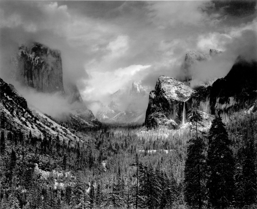
Source: http://www.johnpaulcaponigro.com/blog/11560/masterworks-in-my-collection-ansel-adams-clearing-winter-storm-1944/

Taken by Ansel Adams, this picture is called Yosemite Valley Clearing Winter Storm 1944. This picture is a Fine art landscape and its purpose is to show the Yosemite Valley beautie. The meaning of this picture is that there is hidden beautie in the world, that can be found by anyone; to convey the meaning a little better, he took a wide shot. This way he could capture as much beautie into the picture as possible. This makes the viewer want to explore and see the hidden beautie themselves.

image

Source: http://www.dezeen.com/2012/07/02/alternate-perspectives-by-randy-scott-slavin/

Taken by Randy Scott Slavin, this photo is called Empire State. This an architecture photo, using a mirror sphere, he took a photo of its reflection which was in New York next to the Empire State Building. The purpose of this photo is to show how massive our buildings have got and show the architect of each one. The meaning of this photo is to show how we, the civilisation have built such massive buildings over time and have made huge cities. He was able to convey the meaning by using a mirror ball and positioning the camera facing towards the ball at the right place, that he could capture more buildings and gave the buildings a slight bend. This makes the veiwer interested in New York and also the Empire State by showing its vast city from a low angle.